Introduction
In today’s data-driven business environment, organizations generate information from countless sources, including sales transactions, marketing campaigns, customer interactions, financial systems, operational processes, and connected devices. While collecting data has become easier than ever, turning that data into actionable insights remains a challenge for many businesses.
Decision-makers often struggle with scattered information, disconnected reports, and delayed access to critical performance metrics. Without a clear view of business performance, organizations risk making decisions based on assumptions rather than facts.
This is where a Business Intelligence (BI) Dashboard becomes essential. A well-designed dashboard transforms complex data into meaningful visual insights, enabling executives, managers, and analysts to monitor performance, identify trends, and make informed decisions quickly.
However, not every dashboard delivers value. Many organizations face issues such as information overload, poor data visualization, inconsistent metrics, and complicated reporting structures that reduce dashboard effectiveness.
By following proven Business Intelligence Dashboard Best Practices, organizations can create dashboards that are intuitive, actionable, and aligned with business objectives. This guide explores the key principles, design strategies, and best practices required to build dashboards that support smarter and faster decision-making.
What Is a Business Intelligence Dashboard?
A Business Intelligence Dashboard is a visual reporting interface that consolidates data from multiple sources and presents key performance indicators (KPIs), metrics, and insights in an easy-to-understand format.
Unlike traditional reports that primarily display static tables and spreadsheets, BI dashboards use charts, graphs, scorecards, and interactive visualizations to help users quickly understand business performance and identify opportunities for improvement.
Modern dashboards allow users to monitor business operations in real time, analyze trends, compare performance against targets, and drill down into detailed information when needed.
Dashboard vs. Report vs. Analytics
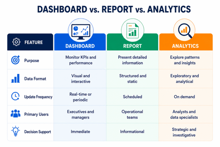
A BI dashboard acts as a bridge between raw data and strategic action, helping organizations transform information into meaningful business outcomes.
Benefits of Business Intelligence Dashboards
Organizations across industries use dashboards to:
- Monitor business performance in real time
- Track progress toward strategic goals
- Improve operational visibility
- Identify trends and opportunities faster
- Enhance collaboration across departments
- Reduce manual reporting efforts
- Support data-driven decision-making
Whether used for sales, finance, operations, marketing, or customer service, dashboards provide a centralized view of performance that helps stakeholders stay informed and aligned.
Why Dashboard Design Matters
A dashboard is only as effective as its design. Even when organizations have access to high-quality data, poor dashboard design can make insights difficult to understand and act upon.
Effective dashboard design ensures that users can quickly locate important information, interpret trends accurately, and make confident business decisions.
Faster Decision-Making
Business leaders often need immediate access to performance data. A well-structured dashboard eliminates the need to search through multiple reports, reducing the time required to gather and analyze information.
When critical metrics are presented clearly, decision-makers can respond faster to opportunities, risks, and changing market conditions.
Improved Visibility into Business Performance
Dashboards provide a consolidated view of business activities, making it easier to understand how different departments, processes, or initiatives are performing.
Instead of relying on separate reports from multiple systems, stakeholders can access a single source of truth that reflects current business performance.
Better Alignment Across Teams
When executives, managers, and operational teams use the same dashboard and metrics, communication improves significantly.
Shared visibility into KPIs helps ensure that everyone is working toward common business objectives and evaluating success using consistent performance measures.
Reduced Reporting Complexity
Traditional reporting often involves manual data collection, spreadsheet consolidation, and time-consuming analysis.
BI dashboards automate much of this process by integrating data from multiple sources and presenting information through intuitive visualizations. This reduces reporting effort while improving accuracy and consistency.
Real-World Example
A retail company operating across multiple locations previously relied on weekly spreadsheets to monitor sales performance. Managers spent several hours collecting and consolidating data from different stores.
After implementing a centralized BI dashboard, sales data was updated automatically and made available in real time. Reporting time was reduced from several hours per week to less than 30 minutes, allowing managers to focus more on improving performance and less on preparing reports.
Key Components of an Effective BI Dashboard
Creating an effective dashboard requires more than attractive charts and graphs. Successful dashboards are built around business objectives and designed to help users make better decisions.
1. Clear Business Objectives
Every dashboard should be designed with a specific purpose in mind.
Before selecting KPIs or visualizations, organizations should identify:
- What business problem needs to be solved?
- Who will use the dashboard?
- What decisions will users make based on the information provided?
- Which outcomes should the dashboard help improve?
A dashboard that lacks clear objectives often becomes cluttered with unnecessary metrics and delivers limited business value.
2. Relevant KPIs and Metrics
One of the most important dashboard design principles is focusing on the metrics that matter most.
Effective KPI selection depends on business goals and user requirements.
Examples include:
Sales Teams
- Revenue growth
- Conversion rates
- Pipeline value
- Customer acquisition cost
Customer Service Teams
- Resolution time
- Customer satisfaction scores
- Ticket backlog
- First-contact resolution rate
Operations Teams
- Production output
- Inventory turnover
- Equipment utilization
- Process efficiency
Including too many metrics can overwhelm users and make dashboards harder to interpret. The most effective dashboards focus on actionable KPIs that directly support decision-making.
3. Accurate and Consistent Data
Even the best-designed dashboard becomes ineffective if the underlying data is unreliable.
Organizations should establish strong data governance practices that include:
- Standardized metric definitions
- Automated validation processes
- Data quality monitoring
- Consistent reporting standards
Reliable data builds trust in the dashboard and improves user adoption across the organization.
4. Interactive Capabilities
Modern dashboards are expected to do more than display information. Users increasingly want the ability to explore data and uncover deeper insights.
Common interactive features include:
- Date range filters
- Geographic filters
- Product or category filters
- Department-level views
- Drill-down reporting
These capabilities allow users to move beyond high-level summaries and investigate performance in greater detail without creating additional reports.
5. Real-Time Data Visibility
Many organizations operate in fast-moving environments where delayed information can lead to missed opportunities.
Real-time dashboards help businesses monitor:
- Sales performance
- Customer support operations
- Supply chain activities
- Manufacturing processes
- Financial performance
Access to up-to-date information enables faster responses and more proactive decision-making.
6. User-Friendly Design
A dashboard should simplify information, not complicate it.
Best practices for usability include:
- Clear labels and titles
- Logical information hierarchy
- Consistent formatting
- Minimal scrolling
- Responsive layouts for different devices
When users can understand information quickly, dashboard adoption and effectiveness improve significantly.
Real-World Example
A SaaS company initially displayed more than 40 metrics on its executive dashboard. Leadership teams struggled to identify the information most relevant to strategic decision-making.
After redesigning the dashboard to focus on customer retention, monthly recurring revenue (MRR), customer health scores, and support response times, executives gained clearer visibility into business performance. Within six months, the company improved customer retention by 15% by acting on insights that were previously hidden within excessive data.
By focusing on business objectives, relevant KPIs, data quality, interactivity, real-time visibility, and usability, organizations can create dashboards that transform data into meaningful business intelligence.
Business Intelligence Dashboard Best Practices
Building an effective dashboard requires more than connecting data sources and creating charts. The most successful dashboards are designed with the end user in mind and focus on delivering actionable insights that support business objectives.
The following Business Intelligence Dashboard Best Practices can help organizations create reports that improve decision-making and maximize the value of business data.
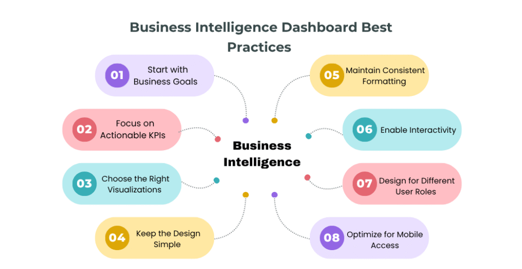
1. Start with Business Goals
The foundation of every successful dashboard is a clear understanding of business objectives.
Before selecting metrics or designing visualizations, organizations should determine:
- What business problem needs to be solved?
- Which decisions will users make using the dashboard?
- What outcomes should be improved?
A dashboard designed around business goals is far more effective than one built simply around available data.
For example, a sales dashboard should focus on revenue growth, pipeline health, and conversion rates rather than displaying every available sales metric.
2. Focus on Actionable KPIs
One of the most common dashboard design mistakes is including too many metrics. While it may be tempting to display every available data point, excessive information often creates confusion and makes it difficult for users to identify what truly matters.
An effective dashboard should focus on KPIs that directly support business objectives and decision-making. For example, sales teams typically monitor metrics such as revenue growth, sales conversion rates, pipeline value, and customer acquisition costs. Marketing teams often focus on lead generation, campaign performance, and return on investment, while customer service teams track customer satisfaction, resolution times, and ticket volumes.
The goal is to prioritize quality over quantity. Every KPI displayed on the dashboard should help users answer an important business question or take meaningful action.
3. Choose the Right Visualizations
The way information is presented significantly impacts how easily users can interpret and act on data. Selecting the right visualization helps users identify trends, patterns, and performance issues more quickly.
Line charts are ideal for displaying trends over time, while bar charts are useful for comparing performance across products, departments, or regions. KPI cards work well for highlighting critical business metrics, and maps can help visualize geographic performance. Scatter plots are often used to identify relationships between variables and uncover hidden patterns in the data.
Rather than using complex visualizations, focus on clarity and simplicity. Users should be able to understand the key message behind a chart within a few seconds. Well-chosen visualizations improve dashboard usability and support faster, more informed decision-making.
4. Keep the Design Simple
Simplicity improves usability.
Many dashboards fail because they prioritize visual appeal over functionality. Excessive colors, decorative graphics, and cluttered layouts can distract users from important insights.
A clean dashboard should:
- Highlight critical information first
- Use whitespace effectively
- Minimize distractions
- Present data logically
- Reduce unnecessary scrolling
The goal is not to impress users with design elements but to help them make better decisions faster.
5. Maintain Consistent Formatting
Consistency helps users interpret information quickly and accurately.
Standardize:
- Colors
- Fonts
- Date formats
- Currency formats
- Measurement units
- KPI naming conventions
For example, if green indicates positive performance in one section, it should not represent negative performance elsewhere in the dashboard.
Consistent formatting reduces confusion and improves the overall user experience.
6. Enable Interactivity
Modern users expect dashboards to provide flexibility and deeper analysis capabilities.
Interactive features allow users to explore data without requesting additional reports.
Common interactive elements include:
- Dynamic filters
- Drill-down reporting
- Search functionality
- Custom date ranges
- Department-level analysis
- Product-specific views
These capabilities help users uncover insights that may not be visible in summary-level reports.
7. Design for Different User Roles
Not every user requires the same level of information.
Executives, managers, and analysts have different objectives and reporting requirements.
Executives typically need:
- High-level performance summaries
- Strategic KPIs
- Business trends
- Goal tracking
Managers typically need:
- Department-level metrics
- Team performance indicators
- Operational insights
- Process monitoring
Analysts typically need:
- Detailed data exploration
- Advanced filtering
- Trend analysis
- Drill-down capabilities
Tailoring dashboards to user roles improves adoption and ensures stakeholders receive relevant information.
8. Optimize for Mobile Access
Business leaders increasingly access information on smartphones and tablets.
A responsive dashboard should provide a consistent experience across:
- Desktop computers
- Laptops
- Tablets
- Mobile devices
Mobile optimization ensures users can monitor business performance anytime and anywhere.
Real-World Example
A software-as-a-service (SaaS) company struggled with declining customer retention despite having extensive reporting systems.
After redesigning its executive dashboard, the company focused on a small set of critical metrics, including customer churn rate, customer health scores, monthly recurring revenue, and support response times.
By simplifying the dashboard and highlighting actionable KPIs, leadership teams identified retention issues earlier and implemented targeted customer success initiatives. Within one year, customer retention improved by 15%.
Common BI Dashboard Mistakes to Avoid
Even organizations with advanced Business Intelligence platforms can struggle if dashboards are poorly designed. Avoiding the following mistakes can significantly improve dashboard effectiveness.
Too Many KPIs on One Screen
Displaying every available metric creates information overload. Users should immediately understand what requires attention without searching through dozens of charts and indicators. Focus on essential KPIs and provide drill-down functionality for additional details.
Poor Data Quality
Inaccurate data leads to inaccurate decisions. Common data quality issues include:
- Duplicate records
- Missing information
- Inconsistent metric definitions
- Delayed updates
- Manual data entry errors
Establishing strong data governance practices helps maintain trust in dashboard insights.
Using the Wrong Chart Type
Choosing inappropriate visualizations can make data difficult to interpret. Examples include:
- Using pie charts with too many categories
- Displaying trends in tables rather than line charts
- Using complex visualizations when simpler options exist
The simplest visualization is often the most effective.
Lack of Context
Numbers alone rarely tell the full story. For example, monthly revenue of ₹10 million may appear impressive, but without targets, benchmarks, or historical comparisons, users cannot determine whether performance is meeting expectations. Provide context through:
- Targets
- Benchmarks
- Trend indicators
- Historical comparisons
Ignoring User Experience
Complex navigation, cluttered layouts, and excessive scrolling reduce dashboard adoption.
Users should be able to locate important information quickly and intuitively.
Regular user feedback and usability testing can help identify improvement opportunities.
Infrequent Updates
Outdated information reduces confidence in reporting systems.
Automated refresh processes help ensure dashboards remain accurate and relevant.
Types of Business Intelligence Dashboards
Different business objectives require different designs. Understanding the major dashboard categories helps organizations choose the right reporting approach.
Executive Dashboards
Executive dashboards provide a high-level view of organizational performance and are primarily used by senior leadership teams. They typically focus on strategic KPIs such as revenue growth, profitability, customer satisfaction, and business objectives. The goal is to help executives make informed strategic decisions quickly.
Operational Dashboards
Operational dashboards track day-to-day business activities and are commonly used by managers and team leaders. These dashboards often monitor metrics such as productivity, inventory levels, service performance, and process efficiency, enabling teams to respond quickly to operational issues.
Strategic Dashboards
Strategic dashboards measure progress toward long-term business goals. They help organizations track growth targets, market expansion initiatives, customer retention, and other strategic objectives. These dashboards are often reviewed monthly or quarterly by leadership teams.
Analytical Dashboards
Analytical dashboards support detailed data exploration and trend analysis. Business analysts and data teams use these dashboards to identify patterns, uncover opportunities, forecast future outcomes, and gain deeper insights into business performance.
Most organizations use a combination of these dashboard types to support different users and decision-making requirements across the business.
Which Dashboard Type Is Right for Your Business?
Most organizations use a combination of dashboard types. For example:
- Executives rely on strategic and executive dashboards for decision-making.
- Department managers use operational dashboards to monitor daily performance.
- Analysts use analytical dashboards to uncover trends and identify opportunities.
Selecting the right dashboard depends on business goals, user requirements, and reporting complexity.
How to Build a BI Dashboard: Step-by-Step Process
Building an effective BI dashboard requires a structured approach that aligns business goals with data and technology. Following these steps can help organizations create dashboards that deliver measurable value.
Building an effective BI dashboard requires a structured approach that aligns business goals with data and technology. Following these steps can help organizations create dashboards that deliver measurable value.
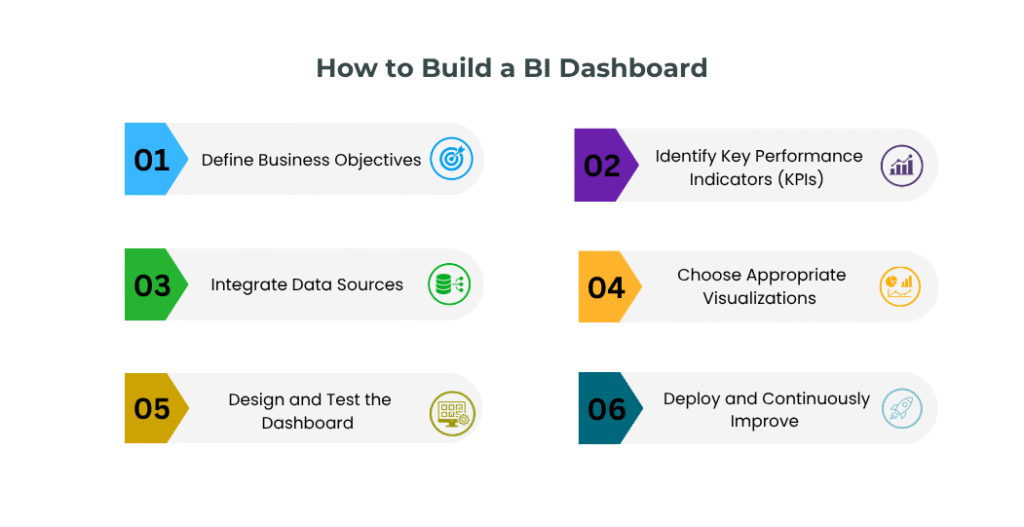
Step 1: Define Business Objectives
Start by identifying the business problems the dashboard should help solve. Ask questions such as:
- What decisions will users make using this dashboard?
- Who are the primary users?
- Which business outcomes should improve?
Clear objectives ensure the dashboard remains focused and relevant.
Step 2: Identify Key Performance Indicators (KPIs)
Select metrics that directly support business goals. Examples include:
- Revenue growth
- Customer acquisition cost
- Customer lifetime value
- Sales conversion rates
- Customer satisfaction scores
- Operational efficiency metrics
Avoid including metrics simply because data is available. Every KPI should support a business decision.
Step 3: Integrate Data Sources
Most organizations collect data from multiple systems. Common sources include:
- CRM platforms
- ERP systems
- Marketing automation tools
- Financial applications
- Customer support platforms
- IoT devices
- Cloud databases
Integrating these sources creates a unified view of business performance.
Step 4: Choose Appropriate Visualizations
Different metrics require different visualization methods. Use charts and graphs that communicate information clearly and accurately.
Focus on simplicity, readability, and user understanding rather than visual complexity.
Step 5: Design and Test the Dashboard
Before deployment, gather feedback from actual users. Evaluate:
- Ease of navigation
- Visual clarity
- Information hierarchy
- Dashboard performance
- Mobile responsiveness
User testing often reveals issues that designers and developers may overlook.
Step 6: Deploy and Continuously Improve
Dashboard development is not a one-time project. Monitor:
- User adoption
- Dashboard performance
- Data accuracy
- Business requirements
Regular updates ensure the dashboard continues to deliver value as organizational needs evolve.
Essential Features Modern BI Dashboards Should Have
Modern businesses require more than static reports. Today’s dashboards should support faster decision-making, deeper insights, and greater operational visibility.
Real-Time Monitoring
Real-time dashboards provide immediate visibility into changing business conditions. Benefits include:
- Faster issue detection
- Improved operational efficiency
- Quicker response times
- Better customer experiences
Organizations can act on information as events occur rather than waiting for scheduled reports.
Predictive Analytics
Predictive analytics helps businesses anticipate future outcomes based on historical data. Common applications include:
- Sales forecasting
- Demand prediction
- Churn analysis
- Inventory planning
These capabilities enable proactive decision-making rather than reactive problem-solving.
AI-Powered Insights
Artificial Intelligence is transforming how organizations interact with data. Modern dashboards can:
- Detect anomalies automatically
- Identify emerging trends
- Generate recommendations
- Provide intelligent alerts
AI-powered insights help users uncover opportunities that may otherwise remain hidden.
Automated Reporting
Automation reduces manual reporting efforts and improves consistency. Features often include:
- Scheduled report generation
- Automated KPI updates
- Email distribution
- Alert notifications
This ensures stakeholders receive timely information without manual intervention.
Self-Service Analytics
Business users increasingly expect the ability to explore data independently. Self-service analytics allows users to:
- Create custom views
- Apply filters
- Analyze trends
- Build ad-hoc reports
This reduces dependence on IT teams and improves decision-making agility.
Role-Based Access Controls
As data volumes grow, security becomes increasingly important. Role-based access controls help organizations:
- Protect sensitive information
- Improve governance
- Maintain compliance
- Reduce security risks
Users can access only the information relevant to their responsibilities.
Real-World Example
A manufacturing company implemented predictive analytics dashboards to monitor equipment performance across production facilities.
By identifying patterns that indicated potential equipment failures, the company reduced unplanned downtime by 20% and improved overall operational efficiency. The dashboard transformed maintenance activities from reactive repairs to proactive planning.
Future Trends in Business Intelligence Dashboards
Business Intelligence continues to evolve as organizations demand faster, smarter, and more accessible insights.
AI-Driven Dashboards
Artificial Intelligence will increasingly automate insight generation, helping users identify trends, opportunities, and risks without extensive manual analysis. Future dashboards will move beyond reporting and actively recommend actions.
Natural Language Queries
Users are increasingly interacting with analytics platforms through convers ational language. Examples include:
- “Show quarterly revenue trends.”
- “Which region generated the highest growth?”
- “Why did customer retention decline last month?”
Natural language capabilities make analytics more accessible to non-technical users.
Embedded Analytics
Analytics is becoming integrated directly into business applications. Rather than switching between systems, users can access insights within their existing workflows, improving productivity and adoption.
Predictive and Prescriptive Analytics
Organizations are moving beyond understanding what happened to understanding what will happen and what actions should be taken. Future dashboards will increasingly answer:
- What happened?
- Why did it happen?
- What will happen next?
- What should we do about it?
Real-Time Decision Intelligence
Combining live data, predictive analytics, AI insights, and automation will enable organizations to make decisions faster and with greater confidence.
This shift toward continuous intelligence will become a major competitive advantage for data-driven businesses.
Key Takeaways
- Align dashboard design with business objectives.
- Focus on actionable KPIs rather than excessive metrics.
- Use appropriate visualizations to simplify decision-making.
- Maintain high data quality and consistency.
- Enable interactivity and drill-down capabilities.
- Optimize dashboards for multiple user roles and devices.
- Continuously improve dashboards based on user feedback and business needs.
Organizations that follow these Business Intelligence Dashboard Best Practices can transform raw data into meaningful insights that support better business outcomes.
Conclusion
A well-designed Business Intelligence Dashboard is one of the most valuable tools for modern organizations seeking to make data-driven decisions. By converting complex information into clear and actionable insights, dashboards help executives, managers, and analysts monitor performance, identify opportunities, and respond quickly to changing business conditions.
Successful dashboards are built around business goals, focus on meaningful KPIs, prioritize usability, and provide real-time visibility into performance. When combined with strong data governance, interactive capabilities, and modern analytics features, dashboards become powerful decision-support systems that drive operational efficiency and business growth.
As organizations continue their digital transformation journey, Business Intelligence dashboards will play an increasingly important role in helping businesses remain agile, competitive, and informed.
Transform Your Business Data into Actionable Insights
At Codeflix Consultancy Services Pvt Ltd, we help organizations design and implement powerful Business Intelligence dashboards, analytics solutions, and reporting systems that deliver real-time visibility into business performance.
Our experts create customized BI solutions that transform complex data into meaningful insights, enabling faster decision-making, improved operational efficiency, and sustainable business growth.
Whether you need executive dashboards, KPI reporting systems, interactive analytics platforms, or enterprise-wide Business Intelligence solutions, our team can help you unlock the full value of your business data.
Contact Codeflix today to build intelligent dashboards that empower smarter business decisions.
FAQ
What is a Business Intelligence Dashboard?
A Business Intelligence Dashboard is a visual reporting tool that consolidates data from multiple sources and presents key metrics, KPIs, and insights in an interactive format to support informed decision-making.
Why are BI dashboards important?
BI dashboards provide real-time visibility into business performance, helping organizations monitor critical metrics, identify trends, and make faster, data-driven decisions.
What are the key components of an effective KPI dashboard?
An effective KPI dashboard includes relevant metrics, accurate data, interactive features, real-time updates, an intuitive design, and alignment with business objectives.
What are the different types of Business Intelligence dashboards?
Common dashboard types include executive dashboards, operational dashboards, strategic dashboards, analytical dashboards, sales dashboards, financial dashboards, and customer analytics dashboards.
What are the most important dashboard design best practices?
Key dashboard design best practices include focusing on business goals, prioritizing actionable KPIs, simplifying layouts, selecting appropriate visualizations, maintaining data consistency, and enabling interactivity.
How do interactive dashboards improve decision-making?
Interactive dashboards allow users to filter data, drill down into details, compare performance metrics, explore trends, help them uncover insights, and make informed decisions more quickly.
What is the difference between a dashboard and a report?
A dashboard provides a visual, often real-time view of KPIs and performance metrics, while a report presents detailed and structured information for analysis. Dashboards support quick decision-making, whereas reports are typically used for in-depth reviews and documentation.
What features should a modern real-time BI dashboard include?
Modern dashboards should support real-time monitoring, predictive analytics, AI-powered insights, automated reporting, self-service analytics, and role-based access controls.
Which Business Intelligence tools are commonly used for dashboard reporting?
Popular BI tools include Microsoft Power BI, Tableau, Qlik Sense, Looker Studio, and SAP Analytics Cloud. These platforms help organizations create interactive dashboards, automate reporting, and gain deeper business insights.